Category: Plugins

  • How to setup AWS to work with Amazon S3 WordPress plugin

    I had huge troubles setting Amazon S3 and Cloudfront to work on my site. I opened an issue on GitHub but Brad was unfortunately unable to help.

    I have no experience with AWS S3. This was the first time I was using it. I was able to fix the issue and here is my solution/walk through.

    After installing the plugin go to the IAM console.

    AWS-user-number

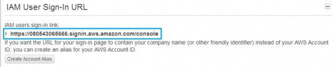
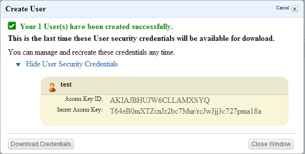
    Copy the user number from the IAM User Sign-In URL to a safe place. Then go to the users section. Create a new user. Copy the Security credentials to a safe place.

    AWS-new-user

    Then open `wp-config.php`. Copy the following code to your wp-config.php and replace the stars with the keys that you placed in a safe place.

    `define( ‘AWS_ACCESS_KEY_ID’, ‘********************’ );`
    `define( ‘AWS_SECRET_ACCESS_KEY’, ‘****************************************’ );`

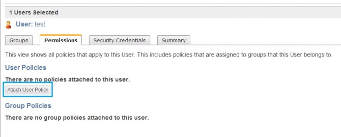
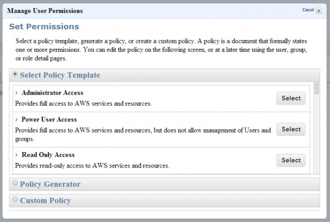
    Attach a user policy. I used the Power User Access policy.

    AWS-manage-user

    AWS-manage-permisions

    Then go to your bucket or create a bucket.

    You need to create a bucket access policy. You can use the Policy Generator.

    AWS-generate-policy

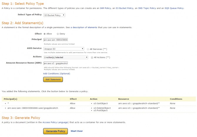
    Change the type of policy to “S3 Bucket Policy”.

    The Principal field is the username field. You need to create a string in this format `arn:aws:iam::account-number-without-hyphens:user/username`. My Principal field would look like this `arn:aws:iam::080543065666:user/test`

    For the Actions you only need two: DeleteObject and PutObject.

    As for the Amazon Resource Name (ARN) you just add `arn:aws:s3:::bucket-name/*`. Mine is `arn:aws:s3:::grapplerulrich-standard/*`

    You then click Add statement and this give you access to add and delete items from the bucket.

    You only need to give everyone access to view the files. Set the fields as such and change to your bucket.

    Principal: *

    Actions: GetObject

    Amazon Resource Name (ARN): arn:aws:s3:::grapplerulrich-standard/*

    Add the statement again and then Generate Policy. You get some text like in the gist.

    {
    “Version”: “2008-10-17”,
    “Id”: “Policy1390863004147”,
    “Statement”: [
    {
    “Sid”: “Stmt1390862961939”,
    “Effect”: “Allow”,
    “Principal”: {
    “AWS”: “*”
    },
    “Action”: “s3:GetObject”,
    “Resource”: “arn:aws:s3:::grapplerulrich-standard/*”
    },
    {
    “Sid”: “Stmt1390863001515”,
    “Effect”: “Allow”,
    “Principal”: {
    “AWS”: “arn:aws:iam::080543065666:user/grapplerulrich”
    },
    “Action”: [
    “s3:DeleteObject”,
    “s3:PutObject”
    ],
    “Resource”: “arn:aws:s3:::grapplerulrich-standard/*”
    }
    ]
    }

    Go to your bucket properties and edit the bucket policy.

    AWS-Bucket-Policy

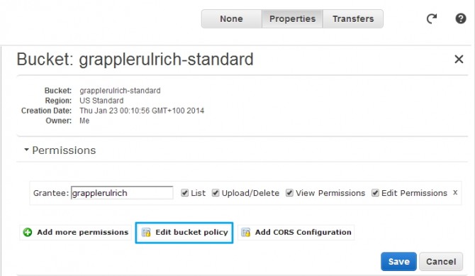
    Paste the generated policy in the text field and save it. You should be now ready to go.

  • Responsive Opt-Out plugin

    Responsive Opt-Out allows visitors of your site to switch between the flexible and fixed width layout.

    This simple setup creates a body class called “responsive” and “fixed-width” both are added to the body class of your Theme. These two classes are used to define whether or not visitor wants a “responsive” environment.

    Here is a demo site that I have created using Responsive:

    Demo

    This the code you use for the switch buttons.

    <a href="#" onclick="return FixedWidth();" class="fixed-width-link">Fixed Width</a>
    <a href="#" onclick="return Responsive()" class="responsive-link">Reponsive</a>

    This CSS would display the right button in the right view.

    .responsive .fixed-width-link {
    	display: block!important;
    }
    .responsive .responsive-link {
    	display: none!important;
    }
    .fixed-width .fixed-width-link {
    	display: none!important;
    }
    .fixed-width .responsive-link {
    	display: block!important;
    }

    Here I was working in a child theme so was unable to edit the parent media queries but was still able to get a good result resting the css in the media queries.

    The basic fixed width CSS needed for Responsive would be:

    /* =Fixed Width
    -------------------------------------------------------- */
    .fixed-width #container,
    .fixed-width #footer {
    	width: 960px!important;
    }
    
    .fixed-width .grid, 
    .fixed-width .grid-right,
    .fixed-width .menu ul, 
    .fixed-width .menu li, 
    .fixed-width .footer-menu li, 
    .fixed-width .sub-header-menu li {
    	float: left!important;
    }
    
    .fixed-width .top-menu {
    	float: right!important;
    }
    
    .fixed-width #logo {
    	float: left!important;
    }
    
    .fixed-width .tinynav {
    	display: none!important;
    }
    
    .fixed-width .sb-holder {
    	display: none!important;
    }
    
    .fixed-width .menu {
    	display: block!important;
    }
    
    .fixed-width #featured p {
    	font-size: 18px!important;
    	line-height: 27px!important;
    }
    
    .fixed-width .featured-title {
    	font-size: 60px!important;
    }
    
    .fixed-width .featured-subtitle {
    	font-size: 2.25em!important;
    }
    
    .fixed-width .call-to-action a.button {
    	font-size: 24px!important;
    	padding: 15px 35px!important;
    }
    
    .top-widget {
    	float: right!important;
    }
    
    .fixed-width .top-widget area,
    .fixed-width .top-widget select,
    .fixed-width .top-widget textarea,
    .fixed-width .top-widget input[type="text"], 
    .fixed-width .top-widget input[type="password"] {
    	width: auto!important;
    }
    
    .fixed-width .widget-title,
    .fixed-width .widget-title-home h3 {
    	font-size: 24px!important;
    	height: 23px!important;
    	line-height: 23px!important;
    	text-align: left!important;
    }
    
    .fixed-width .main-nav #responsive_current_menu_item {
    	display: none!important;
    }
    
    .fixed-width .main-nav .menu {
    	top: 0;
    }
    
    .fixed-width .main-nav .menu a {
    	font-weight: 700!important;
    }
    
    .fixed-width .main-nav .menu li a {
    	color: #fff;
    	border: none;
    }
    
    .fixed-width .main-nav .menu li.current_page_item,
    .fixed-width .menu .current_page_item a,
    .fixed-width .menu .current-menu-item a,
    .fixed-width .main-nav .menu li {
    	background-color: transparent;
    }
    
    .js .fixed-width .main-nav .menu li a:hover,
    .js .fixed-width .main-nav .menu li li a:hover {
    	background-color: #808080;
    	background-image: -webkit-gradient(linear,left top,left bottom,from(#808080),to(#363636));
    	background-image: -webkit-linear-gradient(top,#808080,#363636);
    	background-image: -moz-linear-gradient(top,#808080,#363636);
    	background-image: -ms-linear-gradient(top,#808080,#363636);
    	background-image: -o-linear-gradient(top,#808080,#363636);
    	background-image: linear-gradient(top,#808080,#363636);
    	color: #fff;
    	filter: progid:DXImageTransform.Microsoft.gradient(startColorstr=#808080,endColorstr=#363636);
    }

    Download

    You can also find the plugin on github.

    Extra

    I would be interested to see how many visitor use the button. You can track the number of click of the buttons with the use of Google analytic events. The results can be viewed in the Google Analytic dashboard. The html for these buttons will look like this.

    <a href="#" onclick="_gaq.push(['_trackEvent', 'Click', 'Responsive Opt-Out', 'Fixed Width']); return FixedWidth();" class="fixed-width-link">Fixed Width</a>
    
    <a href="#" onclick="_gaq.push(['_trackEvent', 'Click', 'Responsive Opt-Out', 'Responsive']); return Responsive()" class="responsive-link">Reponsive</a>

    Thank you Andrew for supporting this plugin.