Stopped working at CyberChimps after working there for two years
Missed WordCamp Europe 🙁
Failed my exams which I will be retaking in 2017
Was able to hand over the organising of the WordPress Meetups in Bern to a friend for the second half of the year as I was not able to attend the Meetups
Became a conscript. I have to serve until end of April 2016 🙁 Then I will be free for the rest of my life. 🙂
Helped organize WordCamp Switzerland
Worked on a new WordPress company that my friend Stefan and I are planning of launching in 2016
Contributed to TwentySixteen and WP 4.4 with a inline docs patch
Contributed to some WordPress related projects like _s and EDD
I agree with Rarst that there is no difference between bundling plugin, libraries or frameworks as they are both are just code. Eric wrote a few thoughts on “Dependency Management in WordPress“. WordPress is still not at the stage where dependency management can be implemented that the average user can use.
A number of themes use setting frameworks. There was once a discussion on the WordPress.org Theme Review mailing list and it was decided that theme developers should ship the themes with the integrated setting frameworks instead of installing the plugin version of the framework using something like TGM. By including the frameworks in the theme the developer is making the decision for the user and not giving him/her further options. Users find it confusing to see plugins that they do not remember installing. The settings frameworks are not the only frameworks. There are others like the metabox frameworks or theme frameworks.
One of my plugins is FluidVids for WordPress. The plugin makes it easier for people to use FluidVids from Todd. I regularly track updates and include them in the plugin. It the developers responsibility to track the updates of the libraries, frameworks or even plugins that they have bundled in their theme and update them as soon as there is an update.
One of the first big problems that I faced when I started with WordPress was how to generate a POT file. In the meantime have been able to look at all of the different tools and see their shortcoming with challenges that I faced when generating a POT file.
Challenges with POT generation
Recently I have been working on projects where the POT file generation needed to be different. Here are three examples:
I was working on Responsive and Responsive Pro. Responsive is currently translated in about 45 languages. A large majority of the strings in Responsive Pro were already translated in Responsive. So to reduce the workload for the translators I created a separate POT for the pro folder which is only in the pro version.
Another example from CyberChimps where we use a framework for all of our themes except for Responsive. The framework is the core folder and it is in every theme. If we created the POT files the standard way then we would have all of the same strings across all of our themes which would create extra work for the translators. We could use a constant and define that in the functions.php but it is not allowed in the current WordPress.org theme review guidelines. The core has it’s own text domain, pot file and translations.
A third example that I came across is when using TGM Plugin Activation. TGM Plugin Activation has it’s own strings with it’s own text domain tgmpa. With the current POT generation solutions the strings will be added to the POT but the translations will not load as the text domain is never loaded. A solution could be to just to load your own version of the strings with your own strings. I know a number of plugins and themes use this library. TGM Plugin Activation should load it’s text domain and have it’s own language folder. We as a community can contribute to it and then themes and plugin are able to profit from the standard strings being fully translated.
Shortcomings of current generators
I also find makepot.php is too narrow minded to use as it expects that the folder name is the same as text domain. There are multiple times where it is not so in developement. I develop the Flowplayer HTML5 WordPress plugin and the GitHub repo is named wordpress-flowplayer as it make sense to separate it from the Flowplayer player GitHub repo which is part of the same GitHub organisation. So when I use makepot it thinks the text domain is wordpress-flowplayer instead of flowplayer5 which is the WordPress.org plugin slug. Another case would be if when developing a plugin in the same WordPress.org svn structure. The main plugin is most times in the trunk folder and makepot.php would then think that the theme slug should be trunk.
Poedit Pro handles text domains great. It check for the header info Text Domain and uses that to define the text domain. It currently supports the WordPress translators comments but the not the plugin or theme meta data yet. This is still a very manual process of creating the POT. It also uses the folder structure to choose the files where the strings are pulled from.
Both makepot.php and Poedit use the location of the files when choosing which strings to add to the POT but neither solution can yet exclude folders.
In November 2013 Stephen Harris released a new solution grunt-pot. I was really pleased with this solution as it includes an option to define the files that you want and do not want to scan. The thing that is missing is that it does not support fetching WordPress meta data and translator comments.
Future POT generator
The perfect POT generator for me would be one that used the text domain to choose which strings get added to POT file. The solution would need to able to define the location of the files, text domain, and the location of the language folder. For WordPress it would be very important that the translator comments and plugin/theme meta data are also included in the POT. The solution should be built using grunt as it works with every OS can be easily integrated in a build workflow.
I have been asked a few times about adding responsive videos. At the time I was unable to give a good answer. Now I have taken time to do a bit of research and I able to give a number of responsive video solutions. The solutions are divided in third party services or self hosted solutions. Some of the solutions have WordPress plugins, these are marked with “WP Plugin”. Here are the solutions and resources I am going to cover.
Update on 8th December 2013
I wrote this post on ThemeID which has now been bought by CyberChimps. I have now updated the post with info to some WordPress plugin and small improvements and now have it on my blog.
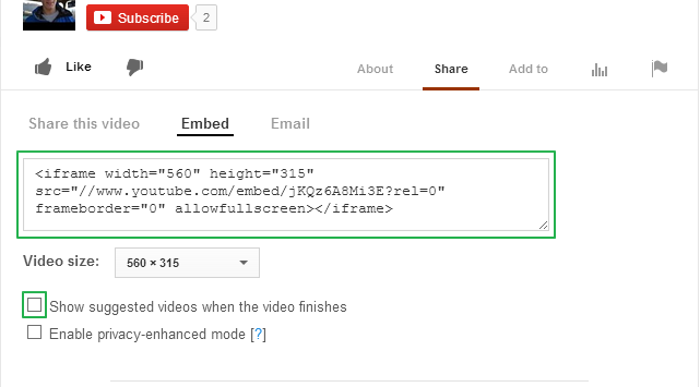
The easiest solution is to use YouTube. It works on multiple devices. In some countries YouTube plays an advertisement before the video. If you upload your own video this should not be the case. At the end of the video you get a grid with other videos. If you don’t want those then when embedding YouTube make sure you uncheck the “Show suggested videos when the video finishes”.
Has additional features e.g. social sharing, call to action, require email to play and a few more which you can find here.
Wistia Embed & Share
Solution 1
This file contains hidden or bidirectional Unicode text that may be interpreted or compiled differently than what appears below. To review, open the file in an editor that reveals hidden Unicode characters.
Learn more about bidirectional Unicode characters
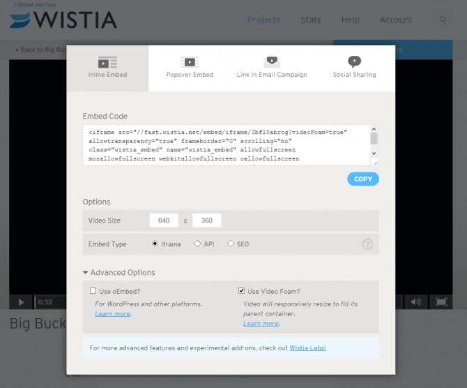
There is a solution where Wistia supports responsive videos with their own code so a JavaScript plugin is not needed. There are three ways of doing this.
The first two are documented on the Wistia DemoBin. There is the Video Foam Lab page where you can paste the embed code to make it responsive.
If you have an iframe, load the iframe API script in the footer and add `&videoFoam=true` at the end of the url in the iframe. e.g.
This file contains hidden or bidirectional Unicode text that may be interpreted or compiled differently than what appears below. To review, open the file in an editor that reveals hidden Unicode characters.
Learn more about bidirectional Unicode characters
If you have an API or SEO embed, just pass `videoFoam: true` in with your embed parameters, e.g.
This file contains hidden or bidirectional Unicode text that may be interpreted or compiled differently than what appears below. To review, open the file in an editor that reveals hidden Unicode characters.
Learn more about bidirectional Unicode characters
To make all Wistia videos responsive on your site add this code to the header.
This file contains hidden or bidirectional Unicode text that may be interpreted or compiled differently than what appears below. To review, open the file in an editor that reveals hidden Unicode characters.
Learn more about bidirectional Unicode characters
The Wistia WordPress plugin enables oEmbed. This allows you to just insert the special url and then the plugin does the rest so that you see a video on the front end. So that the video is responsive, add &videoFoam=true at the end of the url. e.g. http://grappler-login.wistia.com/medias/3bfl0abrog?embedType=iframe&videoWidth=640&videoFoam=true
These solutions are for those people who want to host their own videos be it on their own server, uploading it through WordPress or hosting it in the cloud like with Amazon S3.
Simple HTML5 Video
Need to create markup
Simple setup
Videos hosted on own site
Different players on every browser
IE 8 and lower are not supported
The video tag is a new standard to display videos. I have added more information then you might need. To understand it best I have split this section into two parts.
This file contains hidden or bidirectional Unicode text that may be interpreted or compiled differently than what appears below. To review, open the file in an editor that reveals hidden Unicode characters.
Learn more about bidirectional Unicode characters
So that the videos will work on multiple browser we will need multiple formats.
Here is a simple code example. I have also added a possibility to load a lower resolution video for smaller devices.
This file contains hidden or bidirectional Unicode text that may be interpreted or compiled differently than what appears below. To review, open the file in an editor that reveals hidden Unicode characters.
Learn more about bidirectional Unicode characters
So to have a responsive HTML5 video you need to have this CSS.
This file contains hidden or bidirectional Unicode text that may be interpreted or compiled differently than what appears below. To review, open the file in an editor that reveals hidden Unicode characters.
Learn more about bidirectional Unicode characters
The same points as for HTML video except with IE8 and lower support
This is how the code would look like with Flowplayer being used as the backup.
This file contains hidden or bidirectional Unicode text that may be interpreted or compiled differently than what appears below. To review, open the file in an editor that reveals hidden Unicode characters.
Learn more about bidirectional Unicode characters
To save time you could use the Video for Everybody generator by Jonathan Neal to generate the code snippet according to your options. (FlashFox player seems to only resize if the browser is refreshed but does not change size dynamically,)
A complete explanation can be found at Kroc Camen’s site, the originator of this technique.
Sublime offers a solution for your own hosted videos and YouTube videos. Chose your option and then add the link to your media or for the YouTube videos add the video id.
Sublime Video Source
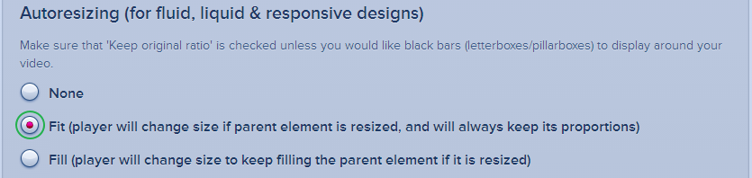
In the video setting the “Fit” option is very important.
Video Settings
At the end you can click on the “Get the Code” button at the bottom. You will then get a code like this.
This file contains hidden or bidirectional Unicode text that may be interpreted or compiled differently than what appears below. To review, open the file in an editor that reveals hidden Unicode characters.
Learn more about bidirectional Unicode characters
The next step is to add the loader code. This add the Java Script. Every site has its own file.
This file contains hidden or bidirectional Unicode text that may be interpreted or compiled differently than what appears below. To review, open the file in an editor that reveals hidden Unicode characters.
Learn more about bidirectional Unicode characters
This file contains hidden or bidirectional Unicode text that may be interpreted or compiled differently than what appears below. To review, open the file in an editor that reveals hidden Unicode characters.
Learn more about bidirectional Unicode characters
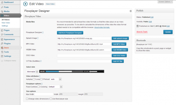
It is really simple to use. You upload the video files and then you add the different file formats and choose a skin and define settings. For every video you get a shortcode that you can paste in a post or page.
Open the zip file and then extract the build folder
Move that build folder to your child theme. You can rename the folder if you want
Load mediaelement-and-player.min.js and mediaelementplayer.min.css
Load this javascript to activate the MediaElements player
This file contains hidden or bidirectional Unicode text that may be interpreted or compiled differently than what appears below. To review, open the file in an editor that reveals hidden Unicode characters.
Learn more about bidirectional Unicode characters
This file contains hidden or bidirectional Unicode text that may be interpreted or compiled differently than what appears below. To review, open the file in an editor that reveals hidden Unicode characters.
Learn more about bidirectional Unicode characters
This is very simple. Install the plugin and then add this shortcode to the post or page. Just change the links to your video.
This file contains hidden or bidirectional Unicode text that may be interpreted or compiled differently than what appears below. To review, open the file in an editor that reveals hidden Unicode characters.
Learn more about bidirectional Unicode characters
This file contains hidden or bidirectional Unicode text that may be interpreted or compiled differently than what appears below. To review, open the file in an editor that reveals hidden Unicode characters.
Learn more about bidirectional Unicode characters
This file contains hidden or bidirectional Unicode text that may be interpreted or compiled differently than what appears below. To review, open the file in an editor that reveals hidden Unicode characters.
Learn more about bidirectional Unicode characters
This file contains hidden or bidirectional Unicode text that may be interpreted or compiled differently than what appears below. To review, open the file in an editor that reveals hidden Unicode characters.
Learn more about bidirectional Unicode characters
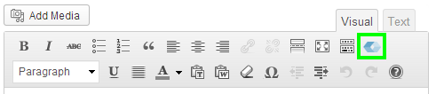
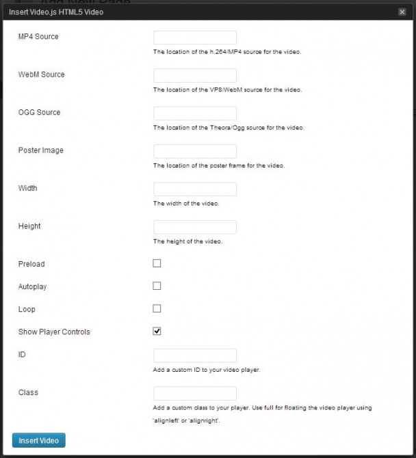
The plugin does make it a bit easier to host the files. Install and activate the plugin. On a page you will find a button to open a form to create the shortcode.
Add Video Button
Video.js Shortcode Form
This is the code that this form will generate.
This file contains hidden or bidirectional Unicode text that may be interpreted or compiled differently than what appears below. To review, open the file in an editor that reveals hidden Unicode characters.
Learn more about bidirectional Unicode characters
This file contains hidden or bidirectional Unicode text that may be interpreted or compiled differently than what appears below. To review, open the file in an editor that reveals hidden Unicode characters.
Learn more about bidirectional Unicode characters
For JW Player 5 you will need to use some hacks. Below are a few of options.
Standard embed with responsive CSS Solution
I have found another way of making JWPlayer responsive. This should be a bit easier.
Add this code to the page or post
This file contains hidden or bidirectional Unicode text that may be interpreted or compiled differently than what appears below. To review, open the file in an editor that reveals hidden Unicode characters.
Learn more about bidirectional Unicode characters
Change the div id so that is different for every video. Make sure it matches the code in the JavaScript.
Add this css
This file contains hidden or bidirectional Unicode text that may be interpreted or compiled differently than what appears below. To review, open the file in an editor that reveals hidden Unicode characters.
Learn more about bidirectional Unicode characters
So that the video keeps its proportion you will need to change the padding-bottom percentage. This is calculated video height / width x 100. E.g. 540 / 960 x 100 = 56.25%.
Copy jwplayer folder to your child theme using a ftp client
Create a html file in the child theme
Paste this code in
This file contains hidden or bidirectional Unicode text that may be interpreted or compiled differently than what appears below. To review, open the file in an editor that reveals hidden Unicode characters.
Learn more about bidirectional Unicode characters
Change four links – Change the location of jwplayer.js, jwplayer.flash.swf, the video link and either update the image link or remove it.
Then add an iframe with the link pointing to the newly created html file.
This file contains hidden or bidirectional Unicode text that may be interpreted or compiled differently than what appears below. To review, open the file in an editor that reveals hidden Unicode characters.
Learn more about bidirectional Unicode characters
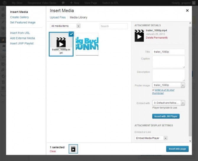
The WordPress plugin supports both JW Player 5 and 6. You can switch between the two. You need JW Player 6 for responsive support. You define the ratio per player.
The easiest way to get your video in the different formats on your computer is to use Miro converter. It is very simple to use but if you need help you can follow this guide.
Heads up! I had some problems playing the webm format in Firefox that was converted by Miro.
Take the ffmpeg.exe file from the updated build – and dropped it into C:Program FilesParticipatory Culture FoundationMiro Video Converterffmpeg – replacing the existing ffmpeg.exe file and then convert without issue using MVC.
We will have to make a new release to update ffmpeg – but in the meantime you can use the workaround and you should be all set.
WordPress does not support webm at the moment and for that reason you will need to add the following code to your themes functions.php. If you are running a multisite you will need to check the list of allowed files.
This file contains hidden or bidirectional Unicode text that may be interpreted or compiled differently than what appears below. To review, open the file in an editor that reveals hidden Unicode characters.
Learn more about bidirectional Unicode characters
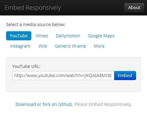
This solution is useful if you only have one or a few videos on your site and you are able to make the iframe responsive.
embedresponsively.com
This then outputs html code like this.
This file contains hidden or bidirectional Unicode text that may be interpreted or compiled differently than what appears below. To review, open the file in an editor that reveals hidden Unicode characters.
Learn more about bidirectional Unicode characters
So that the video doesn’t distort and has the correct aspect ratio the JavaScript calculates the aspect ration. This is calculated by dividing the height by the width in the html code. That is why it is important the width and height is correct.
FluidVids.js is a standalone JavaScript for fluid YouTube/Vimeo iframe embeds. You can easily add more custom/responsive players easily with the options script.
FitVids.js is a lightweight, easy-to-use jQuery plugin for fluid width video embeds. FitVids.js makes iframe embed responsive on the fly. There is a WordPress plugin FitVids for WordPress.
Here are a couple of important things to know about FitVids.js.
The current version of FitVids.js conflicts with Video.js and MediaElement.js. That is why I would recommend using my version. It can be found on GitHub.
When adding iframes from other sources then it is necessary to add selectors. So that I can add an iframe from this site I would use this JavaScript. It is also important to check if www is used or not.
This file contains hidden or bidirectional Unicode text that may be interpreted or compiled differently than what appears below. To review, open the file in an editor that reveals hidden Unicode characters.
Learn more about bidirectional Unicode characters
Note! Please let me know if you would like me add another player. It might take some time. Please let me know if I should include any points that are important(Pro, Cons, Info) to the different players.
You may ask yourself what is so special about this post. Does not the codex cover load_plugin_textdomain() and load_theme_textdomain() but this posts will show what else you can do with it.
With this code for the theme and plugin you can add the translations in different places. The two reasons for this are:
This allows for the translation to be placed in multiple places when the theme/plugin author does not add the translations to the theme/plugin and not have them deleted in every update.
This also allows for the translations to be edited without needing to maintain the whole translation. For example there might be only one string that needs to be different for a site and so can be added to language directory before the theme/plugin language directory.
How do .mo files work?
So with the translation in the mo files if two of the same translations are loaded only the first translation will be displayed. So that is why in these code examples the plugin/theme language folders are loaded last. With if you only need to change a single string you would only need to add a single translation string in the directory that is loaded before.
For the theme there are three different places; the WordPress language directory, the child theme language directory and the parent theme language directory.
This file contains hidden or bidirectional Unicode text that may be interpreted or compiled differently than what appears below. To review, open the file in an editor that reveals hidden Unicode characters.
Learn more about bidirectional Unicode characters
For the plugin there are two different places; the WordPress language directory and the plugin language directory.
This file contains hidden or bidirectional Unicode text that may be interpreted or compiled differently than what appears below. To review, open the file in an editor that reveals hidden Unicode characters.
Learn more about bidirectional Unicode characters
The WordPress language directory can be found in wp-content. The code that we used would mean we would need a plugin or theme directory in the language directory for the translations.
wp-content
– languages
– – plugin-name
– – – plugin-name-de_DE.po
– – – plugin-name-de_DE.mo
– – theme-name
– – – theme-name-de_DE.po
– – – theme-name-de_DE.mo
WordPress 3.7
With the changes in WordPress 3.7 it will add support for automatically installing the right language files and keeping them up to date. These translations will be stored in the WordPress language directory under one directory for themes and another for plugins. The standard directory structure will look like this.
wp-content
– languages
– – plugins
– – – plugin-name-de_DE.po
– – – plugin-name-de_DE.mo
– – themes
– – – theme-name-de_DE.po
– – – theme-name-de_DE.mo
You might ask yourself how this code will work with WordPress 3.7. What ever you are doing in now to load the text domain will work fine in WordPress 3.7. As the code uses the WordPress language directory but not the themes or plugins directory in the WordPress language directory all will be fine.
WordPress checks if there are translation is in plugin/theme and if not then it will load the translation from WordPress language directory. If the translation are in the custom location in the WordPress language directory then the translations will be merged but the translations from the custom location will used unless not defined.
In the future plugin and themes on WordPress.org repository will be able to update translations separately to the plugin or theme updates(This will launched separately to WordPress 3.7).
Otto has a great post on this that must be checked out.
Here is how you could conditionally load only one translation file and all of them one after each other.
This file contains hidden or bidirectional Unicode text that may be interpreted or compiled differently than what appears below. To review, open the file in an editor that reveals hidden Unicode characters.
Learn more about bidirectional Unicode characters
This file contains hidden or bidirectional Unicode text that may be interpreted or compiled differently than what appears below. To review, open the file in an editor that reveals hidden Unicode characters.
Learn more about bidirectional Unicode characters
In my previous post I mentioned that one of the issues of using @import in the child theme is that the JavaScripts that help media queries in IE8 and lower so not work.
So there are three solutions.
When using @import copy the media queries from the parent theme and paste in the child theme stylesheet.
Pro
Simple and easy to do
Con
For the rest of the browsers you have the media queries twice which makes debugging complicated
The media queries needs to be updated if there are any changes in the parent theme
Use the solution of using functions.php that I presented in my previous post.
Pro
Improves the loading speed of the stylesheets
The media queries are only in one place and thus do not need to be updated
Con
This is a bit more complicated and perhaps not so easy to understand for beginners
Theme authors add the media queries in a separate file and have the file always loaded from the parent theme
The prefered method in the codex and with plugins that generate child theme is to load the parent stylesheet by using @import in the child themes stylesheet.
@import url("../twentytwelve/style.css");
There are a few problems with this.
Speed
Using CSS @import in an external stylesheet can add additional delays during the loading of a web page.
Media Query support in IE
Media Queries are not supported in IE8 or lower. So to support media queries on IE 8 and lower JavaScript is using like css3-mediaqueries-js and respond.js.
Note: Doesn’t work on @import’ed stylesheets (which you shouldn’t use anyway for performance reasons). Also won’t listen to the media attribute of the <link> and <style> elements.
@import rules are not supported by respond.js
A solution to this could be to copy the media queries from the parent theme and include them in the child theme but this does not make it easy when there are changes in the media queries.
More Flexibility
This is not really a huge thing but it does make it easier to disable loading the parent stylesheet.
Solution
Now for the solution. Instead of using @import just add this PHP code to the functions.php of your Child Theme. If you don’t have one, simply create new file and name it functions.php
Here is a variation that add the current parent theme version to the stylesheet url.
There might be in some themes where the child theme stylesheet will load before parent theme style sheet. Those themes will have the code like this in the header
For those cases add this PHP code to the functions.php in the child theme.
In the perfect world the parent themes would load the stylesheet like _s does.
Responsive Opt-Out allows visitors of your site to switch between the flexible and fixed width layout.
This simple setup creates a body class called “responsive” and “fixed-width” both are added to the body class of your Theme. These two classes are used to define whether or not visitor wants a “responsive” environment.
Here is a demo site that I have created using Responsive:
Here I was working in a child theme so was unable to edit the parent media queries but was still able to get a good result resting the css in the media queries.
The basic fixed width CSS needed for Responsive would be:
I would be interested to see how many visitor use the button. You can track the number of click of the buttons with the use of Google analytic events. The results can be viewed in the Google Analytic dashboard. The html for these buttons will look like this.